
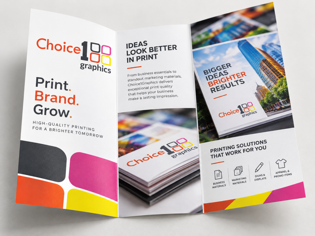
The colors you see on your screen are not the colors that come off our press. This is one of the most consistent sources of frustration for first-time clients, and the issue isn’t anyone’s fault — it’s the nature of the two mediums. But you can pick brand colors that translate well between digital and print, and avoid the colors that don’t. Here’s how.
Why screens and print differ
Your monitor mixes red, green, and blue light to create colors — it can produce extremely bright, vivid colors that physical ink can’t replicate. Print mixes cyan, magenta, yellow, and black inks (CMYK), which has a smaller “gamut” or range. The bright, saturated colors that look amazing on a phone screen often print muddier, darker, or shifted toward a different hue.
Colors that translate well
Mid-saturation versions of warm reds, deep blues, forest greens, charcoal grays, and most earth tones print very close to how they appear on screen. If you’re picking a brand color and want a reliable result across print and digital, stay in this safe zone. Brand colors here will look consistent across business cards, websites, vehicle graphics, and signage.
Colors that don’t translate
Highly saturated neons (electric blues, fluorescent greens, neon pinks), pure RGB primaries (the exact bright red, green, or blue your screen can produce), and rich blacks all behave unpredictably in print. They won’t look bad — but they won’t look the same. If your brand is built on a screen color that doesn’t reproduce in CMYK, you’ll always have a slight mismatch between digital and printed materials.
Pantone: the cheat code
For brand-critical colors, specify a Pantone Matching System (PMS) color. Pantone colors are mixed inks with consistent formulas — when you specify Pantone 200, every printer who runs Pantone 200 ink prints the same red. This is the gold standard for brand color consistency. There’s a small upcharge for true Pantone (spot color) printing on certain jobs, but for business cards, letterhead, and brand-critical materials, it’s worth it.
Soft proofs and hard proofs
For any new brand color or new print project, ask us about a proof. A soft proof is a digital approximation; a hard proof is an actual printed sample. Hard proofs cost a little extra and add a day or two, but they let you see the actual color on the actual paper before we run the full job. Worth it for anything where color matters.
If you’re starting from scratch
If you’re choosing brand colors from the ground up for a new business, talk to us early. We can recommend palette directions that will reproduce reliably across every medium you’ll ever print on.
Bring us your brand color values and we’ll show you printed samples before we commit to a full run. No surprises, no disappointed reorders.
Let’s bring your project to life.
Choice1Graphics can help with this — every job we mentioned here, we do in-house at our Webster shop. Have a project in mind? Reach out for a free quote or stop by 505 S Main St, Webster.